Our entryway is a tiny little space with a mirrored sliding door closet on one side {bleh...but that isn't going to be replaced anytime soon so don't even think of it!} a plain wall on the other side that can't be touched unless it is adding a paper thin wall art because anything added to it would block the door from opening, and then a little wall that faces you that has an alarm keypad right smack in the middle of it with a jumble of light switches around it...charming.
Right now, against that wall, we have a little tiny side table with a tiny drawer and a funky red tray on top that has worked quite well for my purse, our keys and the random stuff you collect at the front door. Problem is...we need that precious little space for the big honking stroller that will need a parking place in the next couple of months! So we can only use the one wall for storage and every wall storage shelf we find is way too long for the size of that wall so we definitely need to come up with some crafty DIY idea. And today I started thinking maybe we could make it snazzier by jumping in on Melanie Bloomer's chalkboard paint obsession, or painting the little wall a punchy red, or adding some great printed wallpaper...D is going to read about these thoughs right here with the rest of you...surprise!!
Anyways...here are some "storage only" ideas that I found for small entryways...don't worry D, we can discuss the additional ideas above!

This cute idea found via Creamy Life seems like a jumble of IKEA stuff that has been repurposed for the hallway. It definitely says there is a kid in the house which I'm not sure is quite what we want when guests arrive...but cute nonetheless!
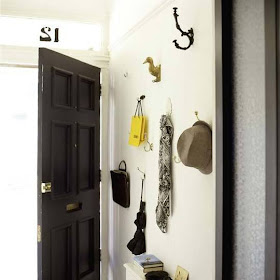
 I do have a bit of an obsession with different types of hooks - this could cure or fuel my obsession but it would sure be fun! And it would mean I could hang them wherever the space permits {around all those silly light switches and alarm keypads} which is pretty awesome. I like the duck! Methinks this could be a top contender. Found this pic via Apartment Therapy.

These two pics are also found via Apartment Therapy. Very clever how they used simple metal mailboxes for hooks and storage space AND kinda like a bulletin board or fridge for the important scraps of paper you tend to collect! I bet you could get some funky mailboxes out there...I'd like red ones! And these giant paperclips are funny too...not totally my style but a fun hook option for heavy purses.

I like this shelf with the under cubbies. Where to get the under cubbies though...I thought IKEA but couldn't see them on the website. They MUST be there somewhere though. Seems like a fairly simple DIY type thing that you could make fit any size area. I think the distressed stool adds to the look of this area but ours will be a giant stroller...not so whimsical!
 Okay so totally not happening in my urban condo but this is pretty darn adorable! The lobster sign is marvelous. Found via Ticking and Toile Blog.
This is so funny, I wouldn't worry about running out of design opportunities, you can redesign each step of your little guys development..."oh! he can reach this shelf/drawer now?!!"
ReplyDeleteStrollers are rarely nice to look at, you might want to shelve/ organize your front mirrored closet to fit in in there... or after a couple weeks of toting it around, the stroller might have a beautiful distressed look to it to replace that lovely stool!
This has given me some ideas for my front space, so thanks for your creative posts girls!
i wish i could fit it in the mirrored closet but it comes with these shelf organizers plus we have our shoe rack in there and its our only closet for coats and shoes and it barely fits those. i've definitely fantasized about ripping it out entirely and having hooks and a great wall of ikea cleverness and ample room but that would be a big reno...sigh...i'm going to go with the distressed stroller look to match my whimsical design. i like your thinking!
ReplyDelete